The Fictional Scenario
Denise, the designer, has sent you a Figma file will all the screens she’s mocked up for the Handshake app. She could really use your help with the text.
Imagine that you’ll be editing the text and then share the Figma file with Denise to prepare for a design review with the Head of User Experience and the VP of Product for Handshake. Your team wants to improve the text so it’s ready for users.
Decision Dialogue
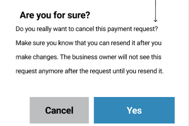
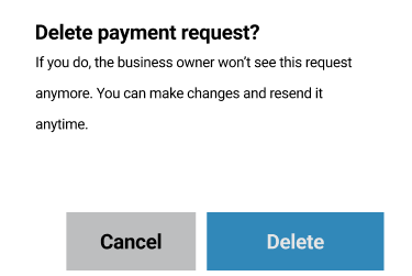
The original cancel message screen (left) was very confusing for the users. Firstly, the heading is vague and users won't necessarily understand what is referring to. I fixed this on my rewrite (right).
These decision dialogues are very important because they ask a question or confirm an action to prevent users from making an unintentional mistake. It's crucial to get them right.
Secondly, the body text adds cognitive burden to the users because there is too much content to process. It needs to be clear and straightforward to prevent errors: my rewrite addresses this.
Thirdly, the action verb for the button should match the headline preceding it. Furthermore, "yes" is a vague word that might lead to mistakes. On my rewrite, the primary action verb "delete" aligns with the heading.
On my rewrite, I wanted to make clear what actions the user is taking, and what will happen next.
Messages Inbox

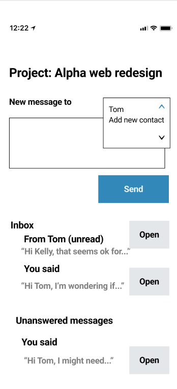
On this rewrite, I focused on making the language as clear and concise as possible in order to reduce cognitive load to users.
I also focused on consistency and content patterns in terms of capitalisation and words used on buttons.
Sending a Message
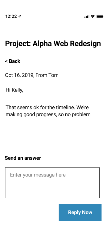
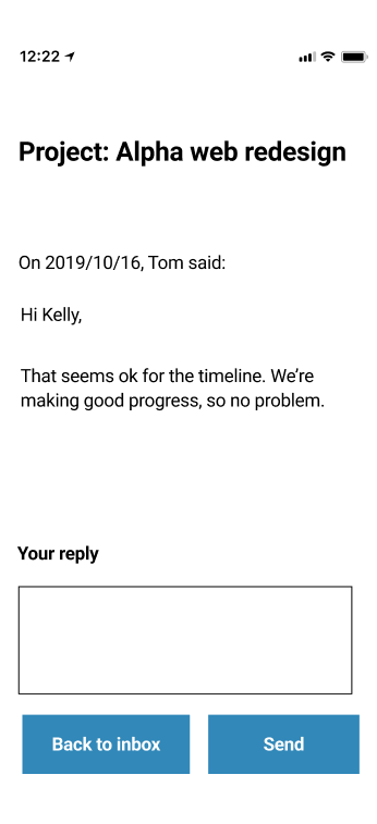
On this rewrite, I changed the date format and capitalisation to match our new style guide. I also modified the navigation buttons so they are both at the bottom of the screen. All these changes improve content scannability and usability.